
Data storytelling is the skill of turning a finding into a decision. You take what the numbers show, explain why it matters to this audience, and say what should happen next.
It sounds obvious. It is also where most analysis dies. A correct chart lands in a meeting, everyone nods, and nothing changes.
This guide shows how to close that gap: how to pick the one insight worth presenting, build a short narrative around it, choose visuals that carry the point, and end with an action somebody owns. It also covers what AI features in reporting tools now do for you, and the part they still cannot do. No statistics background required.
Key Takeaways
- A data story has three parts: trustworthy data, a short narrative, and visuals with a point.
- Start from the decision you want made, not from the data you happen to have.
- One message per slide, one annotated chart, one recommendation with a named owner.
- AI tools can draft the summary, but you still choose the insight and carry the argument.
- Measure the story by what changed afterwards, not by how the meeting felt.
What data storytelling actually is
A data story is a short, structured explanation of a finding, backed by one or two visuals, that ends in a recommendation. That is the whole definition. It is not a longer report; it is usually a shorter one.
Compare two versions of the same information. Version one: a dashboard with eleven tiles, all technically accurate. Version two: one line chart showing that trial signups converted at half the usual rate after the pricing page changed, annotated with the day it went live, plus a recommendation to roll it back and test properly.
The second version is a data story. Same numbers, but the audience knows what happened, why it matters, and what to do.
Why insight so rarely turns into action
The bottleneck is usually not the analysis. It is the handover between the person who found something and the people who can act on it.
Two things cause most of the loss. The first is missing context: a number with no comparison, no time frame and no statement of what it costs. The second is a missing ask. Many presentations describe a situation beautifully and then stop.
The skills side matters too. In DataCamp’s 2026 State of Data and AI Literacy Report, a YouGov survey of more than 500 US and UK enterprise leaders, 88% called basic data literacy important for day-to-day work, while 60% reported a data skills gap. If you cannot assume your audience reads charts fluently, the narrative has to do more work. Building that baseline is the job of a data literacy program.
Why a story lands harder than a table
You do not need neuroscience to explain this. A story gives numbers somewhere to live.
A figure on its own has no anchor. “Churn is 6.4%” invites the question “compared to what?” and most people quietly stop listening while they work it out. A story supplies the comparison, the cause, and the consequence in one pass: churn doubled after the April billing change, it sits almost entirely in monthly plans, and it costs roughly one month of new-customer growth.
Three practical effects follow. People remember structure better than isolated figures, because a setup, a turn and a resolution give them hooks. Concrete beats abstract: “support waits grew” is forgettable, “a customer who writes in on Friday now waits until Tuesday” is not. And stakes hold attention, so tie the finding to revenue, cost, risk, or someone’s workload.
Use emotional framing carefully. A customer quote next to a churn chart is legitimate. Dramatizing a weak result is not, and colleagues notice.
The three parts of a data story
1. Data you can defend
Check the foundation first. Where did the numbers come from? What period do they cover? Who is missing from the sample?
Analysts describe four modes of analysis. Descriptive says what happened, diagnostic asks why, predictive estimates what comes next, and prescriptive recommends an action. Most business stories start descriptive and move one step further, because “what happened” alone rarely justifies a decision.
If several teams pull the same metric and get different answers, the story collapses under the first question. That is a governance problem, fixed with a clear data governance strategy. Wider access helps too: data democratization lets teams check a number themselves instead of taking yours on trust.
2. A narrative with a shape
Use three beats and resist adding a fourth. Setup: what the audience already believes, and the goal this relates to. Insight: what the data shows, and what caused it. Recommendation: the action, the owner and the expected effect.
Write the recommendation first, even though you say it last. If you cannot phrase it in one sentence, the analysis is not finished.
3. Visuals with a single job
Each chart should answer one question. If a chart answers three, split it or cut two of them.
Choosing well is half the work. Trends suit line charts, comparisons suit bars, relationships between two measures suit scatter plots, and geography suits maps. Parts of a whole suit stacked bars.
Build the story in five steps
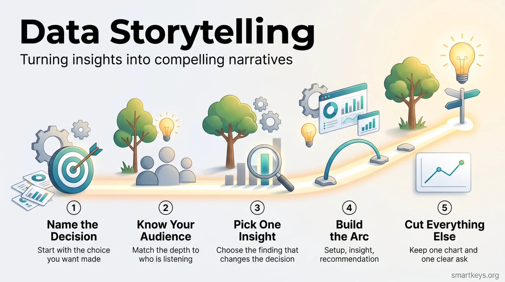
Step one: name the decision. Write the sentence “after this, I want [person] to decide whether to [action].” If you cannot fill in the blanks, you have a report, not a story.
Step two: profile the audience. Executives want the headline, the cost and the ask. Fellow analysts want method and assumptions. Operational teams want to know what changes on Monday. Trying to serve all three at once serves none. If the decision is contested, a structured decision-making model helps the group agree on criteria before anyone sees a chart.
Step three: pick one insight. This is the hardest step, and the one most often skipped. From everything you found, choose the single finding that changes the decision. The rest goes in an appendix.
Step four: build the arc. Setup, insight, recommendation. One or two visuals. Titles that state the finding, not the metric: “Trial conversion halved after the April pricing change” beats “Trial conversion by week.”
Step five: cut. Remove every chart, sentence and number that does not serve the decision. Then test it: can a colleague restate your message from the slide titles alone?
Design visuals that carry the point
A good chart makes the insight visible in a glance. Getting there is mostly subtraction.
Strip decoration. Heavy gridlines, drop shadows, 3D effects and redundant legends all compete with the data. Use one accent color for the series that matters and grey for the rest.
Annotate the exact point of change. If the story is about a drop in March, label March. Never make the audience hunt.
Watch your axes. A truncated vertical axis can turn a 2% change into a cliff. That is a credibility risk, and someone will eventually notice.
Design for everyone in the room: check contrast, avoid relying on red and green alone to carry meaning, and write real alt text for anything published online.
A useful test: show the chart for five seconds, then ask what it says. If they cannot answer, simplify.
Four stories that change decisions
Regional performance. A time series plus benchmark bars shows where growth is pulling ahead or slipping. The story is not the ranking. It is the region whose trajectory turned, and why.
Churn and subscriptions. Segment by cohort: signup month, plan type or acquisition channel. An overall churn rate hides the fact that one cohort is fine and another is leaving. Pair the cohort chart with one action, which is far easier when customer records sit in one place, the job of a customer data platform.
Inventory and stockouts. Link forecast error, supplier lead times and a demand shift to explain why a product ran out. The recommendation is usually an ordering rule, not a dashboard.
The one-slide update. One headline figure, one chart, one ask. This format wins more decisions than any deck, because it fits the time people actually have. The same discipline drives brand storytelling, where one clear message beats a list of features.
For a wider view of how channels and metrics line up across teams, see omnichannel strategies.
What AI does for you now, and what it does not
Reporting tools have changed. Several now write summaries of your data automatically.
Tableau Pulse sends users a digest of their metrics with plain-language explanations of what moved. Microsoft’s Copilot in Power BI drafts narrative summaries and answers questions about a report in ordinary English. Most major platforms now ship a version of this. The category is called augmented analytics, meaning software that finds and describes patterns instead of waiting for you to query them. Our Zoho Analytics and Power BI comparison covers what those AI features cost in practice.
This genuinely helps. First drafts arrive faster, routine variance gets explained without an analyst, and more people can ask a question directly. A good business intelligence tool removes a lot of manual summarizing.
Three things it does not do. It does not choose which insight matters: software can report that a metric moved, but not that the board cares about only one of your four product lines. It does not know your context, so an automated note on a sales dip will not mention that you deliberately paused advertising. And it does not carry the argument, because someone still has to stand behind the recommendation when it is challenged.
There is also a verification duty. Generated summaries state correlations with a confidence they have not earned, so read every claim before repeating it. Where an automated system informs a decision about people, you should be able to explain how it got there, which is the point of explainable AI. The same caution applies to predictive analytics and to AI in decision making generally.
From dashboard to decision
A dashboard reports. A story decides. The gap between them is closed by process, not by better charts.
Get the right three people in the room. Someone who owns the business outcome, someone who knows how the data was built, and someone who knows the operational reality behind the numbers. Missing any one of them produces a confident wrong conclusion.
Agree the question before the meeting. Send the decision, the assumptions and the key risks in advance, so the meeting is about the choice rather than about understanding the chart. It is one of the fastest ways to run more effective meetings, and the same prework suits asynchronous communication.
Turn the recommendation into a plan. One owner per action, a metric that shows whether it worked, a review date, and written assumptions, so you can tell later whether the decision was wrong or merely unlucky.
Keep the story alive between meetings. Annotated dashboards and a short weekly note beat a quarterly deck nobody rereads. A shared productivity dashboard is a simple place to start. The same discipline applies to real-time data: a live number helps only if someone knows what to do when it moves.
Common mistakes, and how to measure success
Four mistakes cause most failed presentations.
Too much at once. Multiple charts per slide and no hierarchy. Limit each page to one message and one supporting visual.
No context. A figure with no benchmark, trend or business framing. Add one sentence on why this number matters to this audience.
No ask. The presentation ends on a chart. Add the recommendation, the owner and the date.
Overclaiming. Presenting a correlation as a cause. Say what you know, say what you suspect, keep the two apart.
Measuring the story is simpler than it sounds. Ask whether a decision was made, how long it took, and whether the agreed action actually happened. Those three answers beat any engagement metric. Leading signals help too: whether stakeholders can restate your takeaway a week later, and whether people quote your framing back to you.
For team-level reporting, RevOps metrics show how to connect an operational number to a revenue result, and an analytics maturity model tells you how much of this your organization can sustain today.
Review failures without blame. Was it the data, the narrative or the visual? Fix that element and try again. Over time, that is what data-driven work looks like in practice.
Conclusion
Good data storytelling is mostly restraint. One decision, one insight, one chart, one ask.
Start with the decision you want made. Choose the single finding that changes it. Build a three-beat narrative around it, design one visual that makes it obvious, then cut everything else.
Try it once this week. Take the report you were going to send anyway, replace it with one annotated chart and one recommendation with a named owner, and see whether the reply comes faster. That will teach you more than any framework.
Found this useful?
Make SmartKeys a preferred source on Google, and our articles will surface more often in your Top Stories, AI Overviews, and AI Mode.
Add as Preferred Source