
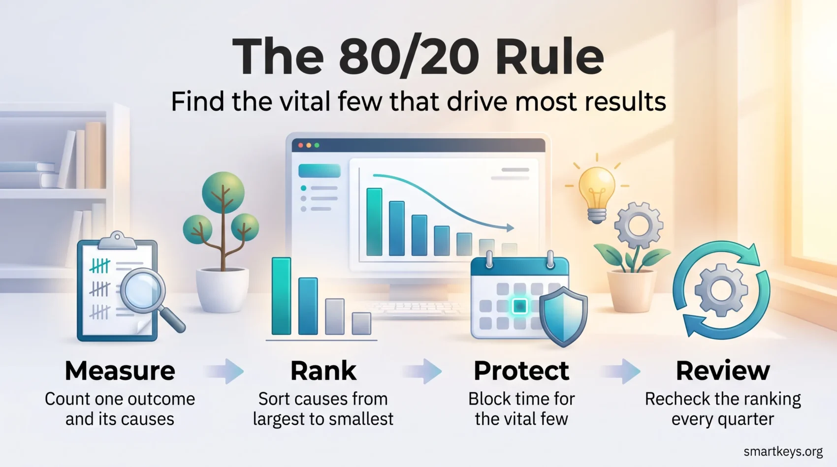
Want more out of the hours you already work? The 80/20 rule says that a small share of what you do produces most of what you get. Find that share, protect it, and the same working day starts to return more.
The idea is usually called the Pareto principle, named after the Italian economist Vilfredo Pareto. It is a pattern you look for in your own numbers, not a formula you apply blindly. This guide explains where the pattern came from, how to test whether it holds in your work, and what to do once you have the answer.
Key Takeaways
- Outcomes are usually uneven: a minority of causes tends to produce the majority of results.
- Pareto observed the pattern in land ownership. Joseph Juran turned it into a management tool.
- A Pareto analysis is simply counting causes, ranking them by impact, and fixing the top few.
- The rule tells you where to look. It does not tell you to work less.
- Distributions shift, so recheck yours every quarter rather than trusting last year’s answer.
What the 80/20 rule actually says
The Pareto principle is the observation that results are rarely spread evenly across their causes. In many situations, a small minority of inputs is linked to a large majority of outputs. The shorthand is 80/20: about 80% of effects come from about 20% of causes.

That sounds abstract until you put real things into it:
- A handful of clients bring in most of your revenue.
- Two or three recurring bugs generate most of your crash reports.
- A few meetings each week produce most of the decisions, while the rest mainly transfer information.
Now notice what the rule does not claim. It does not promise the split is exactly 80 and 20. In your own data it might be 70/30, or 90/10, or something messier. The two numbers also measure different things, one a share of results and one a share of causes, so they never had to add up to 100 in the first place.
Treat the rule as a question rather than an answer: which few things here are carrying most of the weight? That question is useful in almost any situation where you have to choose, which is why the Pareto principle sits at the core of prioritization at work. It pairs naturally with any of the common task prioritization frameworks, because it tells you what to feed into them.
Where the rule came from: Pareto and Juran
The pattern has two parents, and they were working on very different problems.
Vilfredo Pareto and unequal land ownership
Vilfredo Pareto was an Italian economist and sociologist. In his Cours d’economie politique, published in 1896 and 1897, he documented that roughly 80% of the land in Italy was owned by about 20% of the population. He went on to argue that this kind of lopsided distribution of wealth was not an accident of Italian history but a recurring shape in the data.
Pareto himself never wrote a management rule. He described a distribution. Everything practical came later.
Joseph Juran and the vital few
Joseph M. Juran was a quality engineer who, in 1941, took Pareto’s observation about distributions and applied it to defects on a production line. His point was blunt: if a handful of causes create most of your failures, stop spreading your improvement effort evenly and go after that handful first.
Juran called them the “vital few”. He originally paired that with the “trivial many” and later regretted the wording, preferring the “useful many”, because the remaining causes still matter. They just do not deserve the same attention.
That correction is worth carrying with you. The 80/20 rule is a ranking tool, not permission to ignore the rest of your work. Juran’s version of the idea is also where the connection to continuous improvement programs comes from: find the biggest cause, remove it, measure again, repeat.
Why the pattern keeps showing up
Many real-world quantities follow what statisticians call a power law, meaning a distribution where a few very large values sit alongside a long tail of small ones. Website traffic by page, revenue by customer and errors by root cause often look like this. Once you know to expect the shape, you stop being surprised when one account turns out to matter more than the next thirty combined.
“A minority of causes, inputs or effort usually leads to a majority of results.”
Where the pattern shows up in real work
Before you measure anything, it helps to see the shape in familiar places.
Revenue. In many companies a small group of accounts produces the bulk of profit. The exact share varies by business model, but the ranking is almost always steep rather than flat.
Software defects. Support queues tend to cluster. A small number of root causes generate a large share of tickets, which is why triaging by frequency beats working the queue in order.
Product usage. Analytics on most products show a core set of features people open constantly and a long tail they never touch. That is a development roadmap hiding in plain sight.
Your own calendar. Log a week honestly and you will usually find a few blocks that moved something forward, surrounded by hours of reacting.
The ratios differ every time. What repeats is the imbalance, and the imbalance is what you act on. If you want a broader treatment of choosing between competing demands, see this guide to prioritizing the work in front of you.
How to run a Pareto analysis
A Pareto analysis is the disciplined version of the rule. It replaces your assumption about what matters with a count.

Step 1: pick one outcome to explain
Choose something specific and countable. “Refund requests last quarter” works. “Customer unhappiness” does not.
Step 2: collect and group the causes
List every instance and tag it with a cause. Then merge tags that mean the same thing. Ten categories is plenty; forty is a sign you have not merged enough.
Step 3: measure impact, not just frequency
Count how often each cause occurs, and where you can, attach a value: money lost, hours spent, customers affected. A rare cause that costs a fortune can outrank a common one that costs almost nothing.
Step 4: build the Pareto chart
A Pareto chart is a bar chart with the causes ordered from largest to smallest, plus a line showing the running total as a percentage. Read it from the left. The point where that line flattens out marks the boundary between the causes worth fixing now and the ones that can wait. A spreadsheet does this in about five minutes.
Step 5: fix the top causes and measure again
Take the two or three categories on the left of the chart and work on those alone. Then rerun the count. If the chart has changed shape, the fix worked and a new cause is now on top.
Quality teams have used this loop for decades, including inside Six Sigma, a structured improvement method built around reducing variation and defects. You do not need the certification to use the chart. Working from counted evidence rather than the loudest complaint is the whole point of data-driven work.
“These three categories cause most of the pain, so we fix them first.”
Applying 80/20 to your own time
The workplace version of the rule is the one most people meet first. Here is how to make it concrete rather than motivational.

Find your real 20%
Start with evidence. Run a time audit for one normal week: write down what you did in rough half-hour blocks, without editing yourself. At the end, mark every entry that unblocked someone else, moved a deliverable forward or created future revenue.
Those marks are your candidates. They are usually fewer and less glamorous than you expected.
Rank what is left
Once you can see the list, sort it. The Eisenhower Matrix, which splits work by urgency and importance, is a fast way to separate the tasks that only feel urgent. Your to-do list then holds decisions rather than a dump of everything you thought of, which is the difference between a list you use and one you avoid.
Protect the top of the list
Finding the vital few is easy. Defending them is the hard part.
Time blocking, which means assigning specific work to specific hours in your calendar, turns an intention into an appointment. Put your highest-impact task in the hours when you think most clearly. Many teams go further and agree on shared no-meeting hours so that those blocks survive contact with everyone else’s calendar.
Work on one thing inside those blocks. The research on multitasking is consistent: switching between tasks costs time and accuracy, and the cost is highest on exactly the demanding work you were trying to protect. Long, uninterrupted stretches are what make deep work possible.
Deal with the useful many
Expenses, replies and admin do not disappear because they rank low. Handle them deliberately instead of letting them leak across the day. Batch them into a fixed window, or hand them over: clear delegation is the cheapest way to buy back time, and most people delegate later than they should.
Two habits round this out. Doing the hardest important task first, sometimes called eat the frog, keeps the vital few from being pushed to the end of the day. And matching demanding work to your best hours, the core of energy management, matters more than squeezing extra minutes out of a schedule. If your system for capturing and tracking work is the weak link, fix that first with a simpler approach to task management.
The goal is not less effort. It is full effort applied to the right things.
Applying 80/20 in the business
The same analysis works one level up, on customers, products and budgets.

Rank customers by value, not volume
Segment accounts by revenue, margin and growth potential. Margin matters as much as revenue here: a large account that consumes enormous support time can earn less than a quieter one. That is the question behind any serious look at where your profit actually comes from.
Then protect the top segment properly. Assign named owners, agree response times, and review the relationships on a schedule. Losing one of these accounts is far more expensive than winning a new small one, which is why customer retention usually beats pure acquisition on the numbers.
Keep the pipeline alive anyway
Concentration is a strength and a risk at the same time. If a small group of clients produces most of your revenue, losing one of them hurts badly. Ring-fence a portion of your sales effort for new business even in the quarters when the top accounts are keeping everyone busy.
Find the products and features that carry the rest
Review sales by product line and usage by feature. Invest in what people actually use, and be honest about the long tail. Retiring or simplifying an underused feature frees engineering time and removes maintenance work you were paying for quietly.
Align budget and people with the answer
An 80/20 analysis that does not change a budget line has not really happened. Put money, headcount and management attention where the returns concentrate, then set a review cadence so the allocation moves when the distribution does.
“Protect the winners, prune the weak performers, and keep the funnel alive.”
A four-step method for problems
When something is going wrong and nobody agrees on why, this sequence gets you to a decision quickly.
- State the problem in countable terms. “Refunds rose 30% in Q2” gives you something to analyse. “Quality is slipping” does not.
- Find the causes. The 5 Whys technique, which means asking “why did that happen?” repeatedly until you reach something you can actually change, works well here. A few short interviews with the people closest to the problem work just as well.
- Score and rank. Group similar causes and give each one a value in money, hours or affected customers.
- Act on the top of the list. Fix the leading causes, then measure again to confirm the ranking moved.
A worked example: an online retailer reviews 100 complaints and finds that most refund requests trace back to items damaged in transit. Packaging is one fixable cause sitting above a long tail of one-off issues. The team changes the packaging first, then rechecks the complaint mix a month later. Nothing here required a new tool, only a count and the discipline to start at the top. Structured approaches like this also reduce the back-and-forth that makes every decision-making model feel slow.
Limits, misconceptions and honest criticisms
The rule is easy to misuse, usually in one of four ways.
Treating it as a law. It is an empirical pattern, not a guarantee. Some distributions are genuinely flat, and if yours is, the honest conclusion is that there is no vital few to find.
Expecting the numbers to be 80 and 20. They are shorthand. Report what your data says rather than rounding it toward a familiar ratio.
Confusing focus with less work. Concentrating on the top 20% still takes full effort. What changes is the return on that effort, not the amount of it.
Over-fitting to today’s winners. This is the serious one. The analysis only sees what has already happened, so it will always favour the established account over the promising new one and the mature product over the experiment. Run the analysis, then deliberately protect a slice of time and budget for bets it cannot yet score. Long-term goal setting is what keeps that slice from being raided every quarter.
“Use the idea as a guide, not a guarantee.”
A practical playbook
If you want to start this week, keep it small.
Week 1: measure. Run a time audit, or pull one countable outcome such as complaints, tickets or revenue by account.
Week 2: rank. Group the causes, score them by impact and build a simple Pareto chart. Mark the two or three categories at the top.
Week 3: protect. Block calendar time for the highest-impact work before anything else claims it. Batch the supporting tasks into a fixed window and delegate what you can.
Week 4: review. Check whether the metric moved and whether the ranking changed. Adjust and repeat.
Then set a quarterly reminder. Customer bases churn, defect patterns change and the job you were hired to do drifts. An analysis from a year ago is a description of a company that no longer exists.
Conclusion
The 80/20 rule is one of the few management ideas that survives contact with a spreadsheet. Pareto found the shape in land records, Juran turned it into a way to fix production lines, and it still holds wherever outcomes cluster.
Its value is not the ratio. It is the habit of asking which few things are carrying the weight, checking the answer against real counts, and then rearranging your week around what you found. Pick one outcome you care about, count its causes, and fix the one at the top. That is the whole method.
Found this useful?
Make SmartKeys a preferred source on Google, and our articles will surface more often in your Top Stories, AI Overviews, and AI Mode.
Add as Preferred Source