
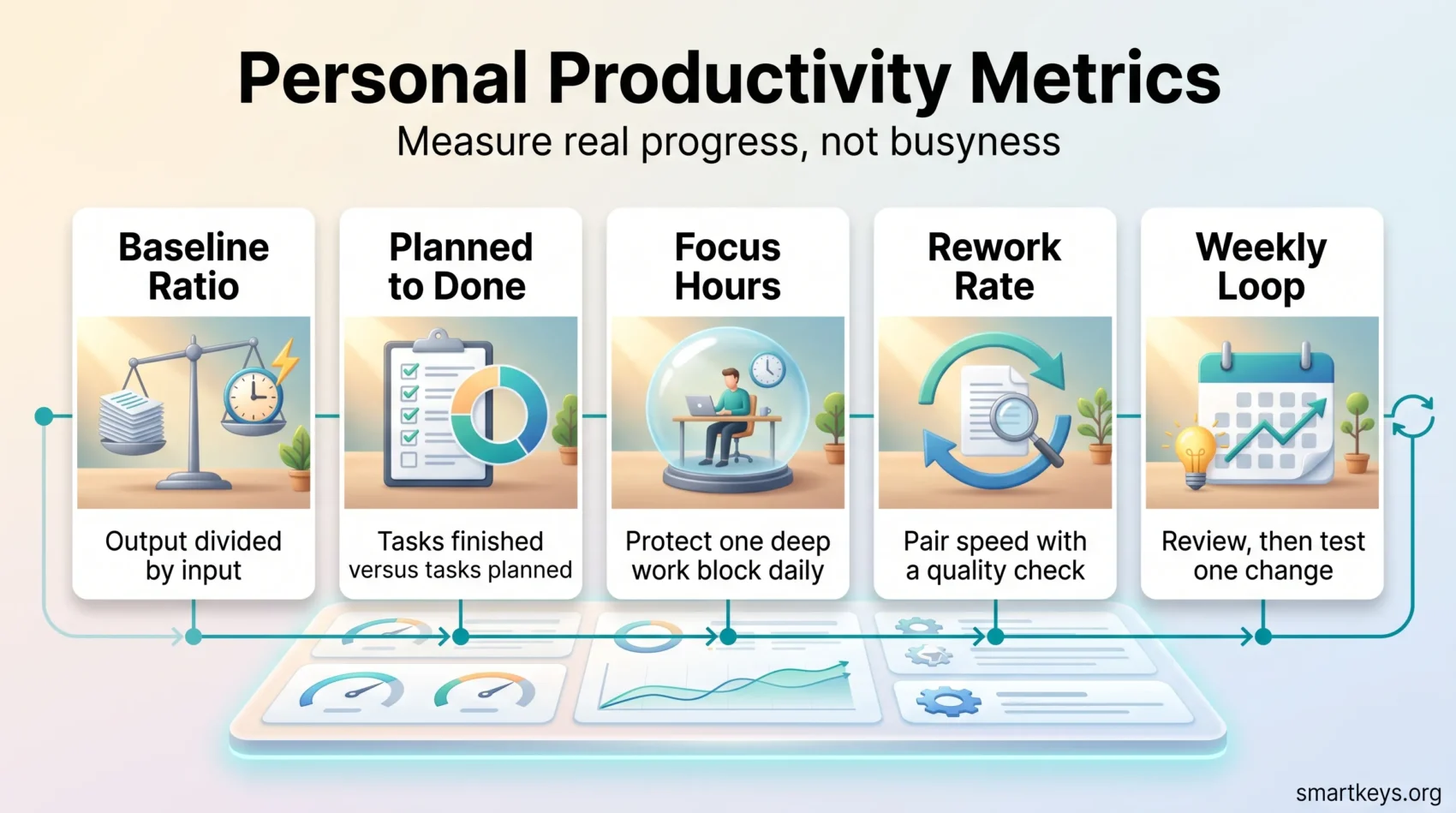
You can measure progress without confusing busyness with real impact. Personal productivity metrics are a small set of numbers you track about your own work, such as how many planned tasks you finish or how many hours of focused work you get. Start with the classic formula: productivity = total output ÷ total input. Output is what you deliver. Input is the time and energy it took.
That single ratio gives you a baseline. From there you can add a few signals that fit your role: focus hours, your planned-to-done rate and how much of your week goes to goal-aligned work.
Pick metrics that help you, not ones that punish you. Badly chosen numbers push people to game them and quietly damage quality. The wider picture in 2026 shows why the choice matters. U.S. nonfarm business productivity rose 1.4% at an annualized rate in the second quarter of 2026 and 2.2% compared with a year earlier, according to the Bureau of Labor Statistics. At the same time, Gallup’s State of the Global Workplace 2026 found only 20% of employees worldwide engaged in 2025, down from 21%. Gallup estimates the cost of low engagement at about $10 trillion, or 9% of global GDP.
In plain terms: output per hour keeps rising, but the people producing it are under strain. A metric set that ignores the human side will mislead you.
Key Takeaways
- Use simple ratios to turn daily work into measurable progress.
- Compare yourself with your own baseline first, and use team data only as context.
- Track focus hours and your planned-to-done rate to spot blockers early.
- Pair every speed metric with a quality metric so faster work does not come back as rework.
- Measure AI-assisted work by cycle time and rework, not by how often you use the tool.
- Keep tracking light: a calendar and a task log beat a dashboard nobody updates.
What productivity metrics mean for your day
Before you pick any numbers, translate your daily goals into signs of progress you can actually see. Productivity can be measured in two ways. Quantitative measures count something, like tasks finished per week. Qualitative measures capture judgment, like a quick self-rating after a block of deep work.
Three words get used as if they meant the same thing, and pulling them apart saves you from measuring the wrong side of your work. Productivity is how much you produce for the time and effort you put in. Efficiency is how little waste that takes: the same report written in two hours instead of four. Effectiveness is whether the report was worth writing at all. You can be highly efficient at work nobody needed, which is why a set of metrics built only on speed will flatter you while your real contribution drops.
The output-to-input ratio is a starting point, not the full answer. A support specialist and a product designer produce very different outputs, so each needs signals that fit the role. Adding that context keeps expectations realistic and makes your planning better.
Keep measurement light. Pull basic data from tools you already use: your calendar, your task board and the timestamps in your inbox. A few consistent signals beat an elaborate system you abandon after two weeks. If you have never mapped where your hours actually go, run a short time audit first. It gives you the baseline everything else is measured against.
- Define value as what you deliver per unit of time and energy, not time spent online.
- Mix outcomes (what you delivered) with enablers (focus time, meeting load) that make those outcomes possible.
- Compare against your own baseline and use a weekly summary to connect daily signals to bigger goals.
Expect some noise. Processes vary, interruptions happen and team context shifts the picture. End each day with one question: what moved forward today, and what got in the way?
Personal productivity metrics you can track today
With that foundation in place, here are the practical signals worth tracking. Each one uses a simple calculation or a quick self-check, so measuring stays useful instead of becoming another chore.
The metrics at a glance
| Metric | Formula or method | Review | What a healthy signal looks like |
|---|---|---|---|
| Planned-to-done ratio | Tasks completed ÷ tasks planned | Daily, summarized weekly | Stable over time; steep drops usually mean over-planning |
| Focus hours | Sum of uninterrupted 60-120 minute blocks | Weekly | At least one protected block per working day |
| Self-rated pulse | 1-10 score plus one line of reasoning | End of day | The trend matters far more than any single score |
| Average resolution time | Total resolution time ÷ items closed | Weekly | Falling or flat, with tagged reasons for outliers |
| Utilization rate | Goal-aligned hours ÷ available working hours | Weekly | Sustainable with buffer; never 100% |
| First-contact resolution | 100 × (resolved first time ÷ total handled) | Monthly | Rising, without shortcuts that create rework |
| Rework rate | Reworked items ÷ delivered items | Monthly | Low, and traced to root causes rather than symptoms |
Planned-to-done ratio
Planned-to-done ratio = tasks completed ÷ tasks planned, shown as a percentage. If you plan eight tasks and finish six, your ratio is 75%. If the number keeps drifting down, you are probably planning too much. Cut scope or split big tasks into smaller pieces.
Focus hours per day
Focus hours are blocks of uninterrupted time for demanding work, often called deep work. Block 60-120 minute windows in your calendar and note each interruption. Then compare those blocks with the time spent on email and quick admin to see where your day really goes.
If you are choosing a structure for those blocks, the comparison between the Pomodoro Technique and time blocking is a good starting point, and the practical guide to time blocking shows how to build a first time-blocked week. The quality of a block depends on single-tasking more than on sheer length.
Self-rated check
At the end of the day, give yourself a score from 1 to 10 and write one sentence explaining it. Combine the daily scores into a weekly pulse. Over a few weeks you will see patterns that raw task counts miss, such as low scores on days packed with meetings.
Average resolution time and utilization
Average resolution time = total time to close items ÷ number of items closed. Tag each delay as “waiting on someone” or “scope changed” so you can see why work stalls.
Utilization rate = billable or goal-aligned hours ÷ available working hours. A consultant with 40 working hours and 28 billable hours has a utilization rate of 70%. Review it weekly, and ask for help when the same bottleneck keeps coming back.
Example: pick one task each week, compare your estimated time with the actual time, note what blocked you and adjust next week’s plan.
- Track effort, not just counts. Note task size so a day of three big tasks does not look worse than a day of ten small ones.
- Capture only a few fields: task name, estimate, actual time and number of interruptions.
- Share highlights with your team so expectations stay aligned.
Time and attention: Managing your hours, not just your tasks
Task metrics tell you what got done. Time metrics explain why. Measure meeting time first, because it usually tells the biggest story about lost focus. Meeting load is simply the number of hours per week you spend in calls and workshops. A heavy load shrinks your focus windows and drags output down.
Meeting load: Protecting time blocks for deep work
Audit your weekly meetings and set a ceiling that still leaves at least one 90-120 minute focus block each day. Move routine updates to written channels and reserve live meetings for decisions. A structured meeting audit helps you decide which recurring meetings to keep, shorten or cancel.
Two ideas make the trade-off concrete. The split between maker and manager schedules explains why a single meeting in the middle of the afternoon costs more than its 30 minutes. And a shift toward asynchronous work, where people share updates in writing on their own schedule, removes most status calls entirely. If your whole team needs protected time, a shared focus time policy sets no-meeting hours everyone respects.
Cycle time for recurring tasks: Shorten your path to completion
Cycle time measures how long a task takes from the moment you start it to the moment it is finished. Track it for recurring work, like a weekly report, to find the slow steps. Watch for Parkinson’s Law: work tends to expand into whatever time you give it, so a tighter deadline often shortens cycle time on its own.
- Run meetings with a clear agenda, timed topics and recorded decisions with owners.
- Group similar tasks to reduce context switching, the mental cost of jumping between unrelated work.
- Agree on a daily focus window so team members can work without interruptions.
- Count interruptions during focus blocks and adjust notifications to lower that number.
- Write checklists or standard operating procedures for routine work to cut cycle time.
Tip: if your team depends on quick replies, agree on response-time expectations so your focus hours stay protected.
Quality and outcomes: Measuring the value behind your output
Speed and volume are only half the story. The next set of signals shows whether your work actually landed. Look beyond counts and check how often a reply or deliverable truly closes the loop.
First-contact resolution for your requests and replies
First-contact resolution (FCR), a measure borrowed from customer support, tracks how often a request is solved in the first reply without follow-up. The formula is 100 × (requests resolved on first contact ÷ total requests handled). Track your personal FCR for questions from colleagues and clients. A rising number means your answers are complete enough to prevent back-and-forth.
Rework signals: Fewer correction cycles per task
Keep a simple rework log. For each item that comes back to you, note what went wrong, why and how long the fix took. There is no universal target for rework. The useful comparison is your own rate from month to month, and whether the same cause keeps showing up.
Satisfaction cues for individual work
After important handoffs, ask one short question, such as “Did this give you what you needed?” on a 1-5 scale. Teams often borrow formats like CSAT (customer satisfaction score) or NPS (Net Promoter Score, which asks how likely someone is to recommend you). Combine those replies with indirect signals, such as repeat requests or stakeholders coming back for more work, to judge lasting value.
- Pair output counts with quality checks so activity does not hide extra follow-up work.
- Review one example per week where quality slipped, then add a checklist step or a peer review.
- Describe quality gains in business terms: fewer correction cycles, faster handoffs, cleaner data.
Measuring AI-assisted work in 2026
Quality metrics become even more important once AI tools enter your workflow. Much knowledge work now passes through an AI assistant at some point, which breaks the old assumption that time spent equals effort spent.
Gallup’s AI in the Workplace indicator shows the gap clearly. As of May 2026, 52% of U.S. employees used AI at least a few times a year and 65% of users reported a positive effect on their productivity. Yet only 14% strongly agreed that AI had transformed how work gets done. In other words, the gains show up in individual tasks long before they show up in how an organization works.
The practical risk is measuring the wrong thing. Prompt counts and tool logins say nothing about value delivered. These four signals do:
- Time to first usable draft. Track the minutes from a blank page to something you would actually edit. This is where AI assistance usually pays off most.
- Edit ratio. Roughly how much of an AI draft survives your review? If you rewrite most of it, the task is not a good fit for the tool yet.
- Rework after delivery. Compare rework on AI-assisted output with your own baseline. Faster is only better if the work does not come back.
- Verification time. Count fact-checking as work. The time spent checking an AI answer belongs in your cycle time, not outside it.
Manager support also matters. Gallup names it the strongest driver of widespread AI adoption, yet only 36% of employees strongly agree that their manager supports it. If your AI gains stay personal and never spread to the team, that is often the reason. It is a management problem, not a metrics problem. A shared prompt library is one practical way to turn individual wins into team habits.
Quick test: take one recurring task and run it with and without AI assistance for two weeks. Compare cycle time and rework. Only the pair of numbers tells you anything.
Communication and collaboration signals that affect your productivity
Your own metrics also depend on how you work with others. Fast replies and busy chat logs can hide constant context switching that slows real progress. Clear norms and a few simple measures protect focus and keep the team moving together.
Response time to internal messages: Set clear expectations
Agree on response times by channel, sometimes called SLAs (service-level agreements). For example: within a few hours for urgent chat, same day for internal email. Replying within seconds to everything usually means costly context switches. Very long delays usually signal unclear priorities. Setting explicit instant messaging boundaries makes those expectations visible to everyone instead of leaving them to guesswork.
Meeting effectiveness: Timeliness, participation and follow-through
Track whether meetings start on time, whether the right people attend and whether action items close by their due date. Shared notes and rotating facilitators increase engagement and ownership.
Collaboration efficiency: Handoffs, throughput and knowledge sharing
Count handoffs per deliverable and measure throughput, the number of finished items per week. Both show how work flows without blaming individuals. A shared knowledge base lets people find answers themselves, which means fewer interruptions for everyone.
Digital presenteeism: Activity versus outcomes in a remote or hybrid day
Digital presenteeism means looking busy online (green status dots, instant replies, long hours logged in) without producing much. Compare activity with actual deliverables to spot it. Prioritize outcomes, and set quiet hours or status signals so constant availability stops being the default.
Tip: keep a one-week log of message volume and response times, then align your team’s norms with the real pattern.
Turn your data into decisions: A simple weekly loop
Collecting numbers is pointless unless they change what you do next. A short weekly loop moves you from observation to a deliberate experiment. Scan four signals: planned-to-done, focus hours, average resolution time and rework rate. Nothing more.
Then pick one change to test next week and define how you will measure success before you start. A simple goal tracking template keeps those experiments connected to the outcome you actually care about, and a regular weekly review gives the loop a fixed slot in your calendar.
Turn numbers into decisions: based on what you see, decide what you will stop, start or continue.
- Use a simple rhythm: plan on Monday, check midweek, review on Friday with one clear action.
- Involve your team to test your assumptions and avoid pushing problems onto others.
- Tie each change to a measurable result, for example cutting interruptions per focus block by a third.
- Keep visuals simple. A one-page productivity dashboard beats a complex tool you will not maintain.
- Look at trend lines over several weeks, not single snapshots, and write down one learning per week.
Quick test: move a routine status meeting to a written update and check whether your focus hours rise and your resolution time improves.
Celebrate small wins to keep momentum. Over a quarter, this loop turns raw data into steady improvement.
Benchmarking without burnout: Using team and business context
Once your personal loop is running, it helps to see how your numbers fit into the bigger picture. Frame your metrics inside company results so you measure contribution, not activity.
Linking your output to team results and revenue per employee
Revenue per employee = company revenue ÷ number of employees. It shows how well a business turns staff time into revenue. Utilization rate, covered above, is the individual counterpart where billable work ties directly to value.
Treat both as background numbers. Focus on the levers you actually control: the quality of your responses, the quality of your deliverables and your throughput.
If you also carry a team’s numbers, keep the two layers apart. Organization-level measures answer questions about staffing and investment: revenue per employee, average utilization across a group, and total cost of workforce, which bundles salaries with recruiting, onboarding, training and contractors. None of them says anything useful about one person’s week. Read them as the weather your own metrics happen in, and segment any comparison by role and task complexity before you draw a conclusion from it.
Spotting trends with dashboards and lightweight KPIs
KPIs (key performance indicators) are the few numbers you agree to watch regularly. Build a small dashboard with weekly trend lines. Ignore daily swings and look for sustained change.
- Choose three or four KPIs that cover output, efficiency and feedback from the people you serve.
- Split the data by task type or priority to find where improvement matters most.
- Use rates and averages rather than raw totals to smooth out one-off spikes.
Share the picture with your team and manager so benchmarks stay fair. Benchmarks should guide growth, not fuel burnout. Set your own baseline and aim for steady, sustainable improvement.
Common pitfalls when measuring productivity (and how to avoid them)
Even a well-designed metric set can go wrong. Numbers tell a story, but that story misleads if you skip context and wellbeing. Use measurement to reveal problems, not to punish people.
The most common failure is subtler than bad data: people spend more time maintaining the tracking system than doing the work. It is one of the classic productivity pitfalls worth watching for.
Focusing on the wrong numbers: Balance speed, quality and value
Do not chase the biggest number. Speed alone can hide poor quality or work nobody needed. Pair measures such as cycle time with rework rate so you improve speed while holding quality.
This failure has a name. Goodhart’s Law says that once a measure becomes a target, it stops being a good measure, because people start improving the number instead of the thing the number stood for. Count tasks closed and you will catch yourself splitting work into tiny tickets. Count hours logged and the hours will appear.
So put every candidate metric through one stress test before you commit to it: could you push this number up next week without anyone you work for being better off? If the answer is yes, the metric is gameable. Pair it with a quality measure, or drop it.
Using team metrics like velocity to judge individuals
Velocity is an agile planning measure: the amount of work a team completes in a sprint, usually in story points. It helps a team plan, not rate a person. Using it to score individuals distorts estimates and erodes trust. Keep team signals out of individual reviews and use role-appropriate indicators instead.
Ignoring context and wellbeing: Meetings, distractions and burnout
Meeting load and digital interruptions change results. With global engagement at 20% and manager engagement down to 22% from 27% a year earlier, according to Gallup, the conditions around your numbers can shift more than your effort does. Tool sprawl makes it worse, and reducing work tech overload often improves a metric faster than trying harder.
If people are overwhelmed, the data will mislead you. Reduce noise and adjust expectations before you interpret anything, and learn the early signs covered in the guide to burnout prevention.
Lacking a feedback loop: Close the gap between data and change
Data without action is decoration. Run the short loop from above: review, decide, change one thing each week. Ask stakeholders and teammates for feedback so your measures guide improvement instead of encouraging people to game them.
- Balance speed, quality and value instead of chasing one big number.
- Do not use team metrics like velocity to rate individuals.
- Account for context: meetings, interruptions and health all affect results.
- Split oversized tasks so they do not distort your ratios.
- Keep qualitative signals next to quantitative ones for a full picture.
- Retire any metric that has not changed a decision in a month.
Conclusion
End each week with one clear experiment. Pick two or three metrics, such as planned-to-done, focus hours, first-contact resolution or utilization, and use them to test a single change that supports your goals.
Protect deep work blocks, trim meetings, measure AI-assisted work by rework rather than usage, and connect your signals to business value. Keep team measures like velocity out of individual judgments, because that distorts both estimates and trust.
Keep reviews focused on action: run a short weekly check, capture one learning and retire any measure that no longer drives a decision. That is the whole system, and it is small enough to survive a busy quarter.
Found this useful?
Make SmartKeys a preferred source on Google, and our articles will surface more often in your Top Stories, AI Overviews, and AI Mode.
Add as Preferred Source