
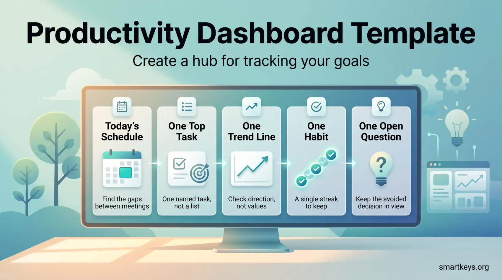
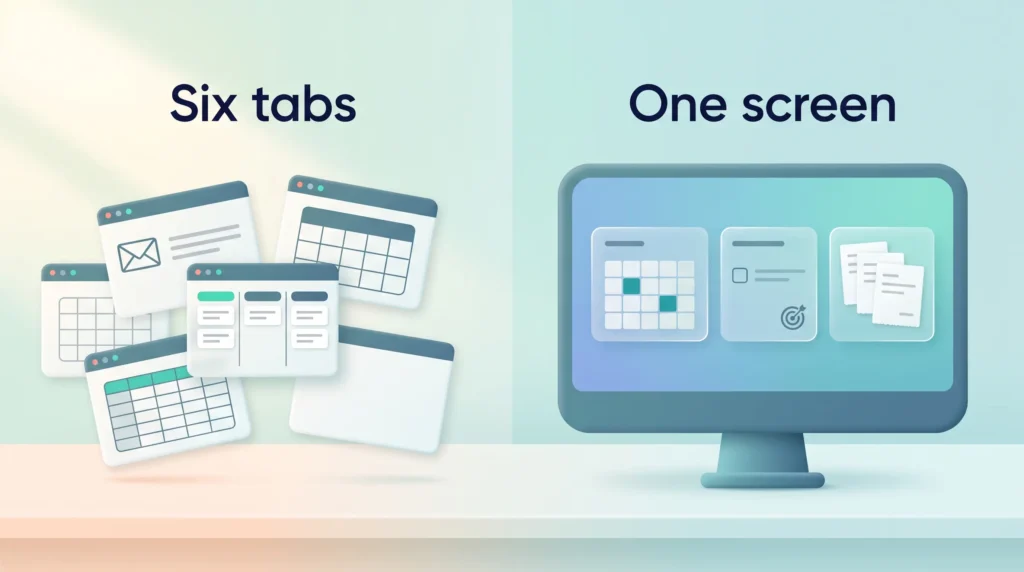
A productivity dashboard is one screen that shows what you are supposed to do today and whether you are on track. Nothing more than that. It replaces the ritual of opening six tabs every morning just to work out where you stand.
Most people do not need new software to build one. They need a decision about what belongs on the screen, and the discipline to leave everything else off.
This guide walks through that decision, then shows three ways to build the screen: a browser start page, a page in the notes app you already use, or a spreadsheet. Each takes under an hour.
Key Takeaways
- A dashboard is a decision aid, not a report. If a widget never changes what you do next, remove it.
- Pick two or three outcomes first, then one metric for each. Sources come last.
- Five components cover almost every case: today’s schedule, today’s top task, one trend, one habit, one open question.
- Live data beats manual updates, but a hand updated dashboard you actually read beats an automated one you ignore.
- Review the layout monthly. Dashboards rot quietly when goals move and tiles do not.
What a productivity dashboard actually is
The word “dashboard” comes from business intelligence, where it means a screen of charts fed by a database. A personal productivity dashboard shrinks that idea to a single view answering three questions in a few seconds: what is happening today, what is the one thing I have to finish, and is my longer term work moving.
Business teams usually tell three kinds of dashboard apart. Strategic dashboards follow long term goals. Operational dashboards show what is happening today. Analytical dashboards dig into historical data to explain why a number moved. A personal dashboard is mostly operational, with a small strategic element: one line that shows whether the bigger goal is moving. You rarely need the analytical kind on it. When you want to understand a bad month, a spreadsheet or your weekly review does that job better than a screen you glance at each morning.
That is a narrow job, and the narrowness is the point. A dashboard is not a task manager, a calendar or a note archive. Those stay where they are. The dashboard is the layer on top that tells you which one to open first.
Here is the difference in practice. Without one, a freelance designer opens email, then her calendar, then a client board, then an invoice spreadsheet, and twenty minutes later the first email has already set her agenda. With one, she opens a single page: two meetings, one deliverable due Thursday, three invoices unpaid. She knows what to do before anything else asks for her attention.
That is also why a dashboard helps with deep work, the long uninterrupted stretches where demanding tasks get finished. Deciding what to work on is itself a task. Doing it once, on one screen, leaves more of the morning intact.
Decide what the dashboard is for before you build it
The most common way a dashboard fails is that someone builds the layout first and then looks for things to put in it. You end up with a beautiful page of numbers nobody acts on. Work in the other order.
Name two or three outcomes
Write down what you want to be true in three months. Not activities, outcomes. “Ship the client portal,” “reach 40 paying customers,” “finish the certification.” Two or three is the limit, because a dashboard tracking seven goals tracks none of them.
A plain sentence per outcome is enough to start. Our guide to setting personal OKRs covers how to phrase one so it stays measurable without becoming bureaucratic.
Pick one metric per time horizon
For each outcome, choose one number you can check daily, one you check weekly, and one you check monthly. Daily is usually an activity count (pages written, calls made, tickets closed). Weekly is a milestone (feature merged, module finished). Monthly is the outcome number itself (customers, revenue, chapters done).
If you are unsure what to count daily, two measures fit almost any knowledge job. The first is a planned to done ratio: of the tasks you planned for today, how many did you finish? A ratio that stays low for a week usually means you plan too much, not that you work too little. The second is focus hours, the time you spent on demanding work without interruptions. It shows quickly when meetings and messages are eating your day.
Resist the urge to add a fourth. The point of one metric per horizon is that when it moves the wrong way, you know exactly what to look at. If you are unsure which numbers are worth watching at all, choosing personal productivity metrics goes deeper on that choice, and goal tracking methods covers how to record progress without turning it into a second job.
Match each metric to a source you already use
Now, and only now, ask where each number lives. Meetings come from your calendar. Tasks come from whatever board or list you already keep, whether that is a Kanban tool or a plain daily to-do list. Revenue comes from your invoicing tool or accounting software. Site or product numbers come from your analytics.
If a metric has no source you can reach in one click, either find a proxy that does or accept that you will update it by hand each week. Both are fine. Inventing a new tracking system to feed the dashboard is not, because that system will be abandoned before the dashboard is.
The five components worth including
Almost every useful personal dashboard contains the same five things. Order them by how you actually move through a morning: context first, action second, trend third.
1. Today’s schedule. A read only view of the current day. What you are looking for is not the meetings but the gaps between them. Two clear hours before lunch is the most valuable line on the whole screen, because that is where demanding work goes. If your calendar is so fragmented that no gap exists, that is itself a finding, and calendar management is the problem to fix first.
2. Today’s single top task. One task, named specifically, visible without scrolling. Not a list: a list invites you to pick the easiest item, while one task removes the choice. Everything else stays in your task manager, one click away. If naming that task is hard, task management fundamentals covers how to break work down until a single next action is obvious.
3. One trend line. A small chart of the metric that matters most this month. A line, not a table, because you are checking direction rather than reading values. Pull it from your analytics, a spreadsheet formula or a saved report in whatever business intelligence tool you already have.
4. One habit or streak. A single behaviour you want to make routine: writing before email, a daily review, thirty minutes of study. A small habit tracker tile is enough; a full habit system here is too much.
5. One open question. The most underrated tile: a single line you edit yourself, such as “Do we ship Friday or slip a week?” It keeps the decision you are avoiding in view, and needs no integration at all.
Anything else, weather, news feeds, quotes, is decoration. Not forbidden, but it should never sit above those five, because whatever is at the top of the screen gets your morning attention.
Visual cues that earn their space
How you display the five tiles matters almost as much as which ones you choose. Three cues are worth adding. A progress bar toward the monthly outcome shows at a glance how far you still have to go. A deadline countdown next to the top task (“due in 2 days”) creates more urgency than a bare date. And color works best when you reserve it for exceptions. If every item is green, orange or red, nothing stands out, so let only overdue or blocked items change color.
Three ways to build it
The right build depends on where you already spend your day. All three work; none of them require an engineer.
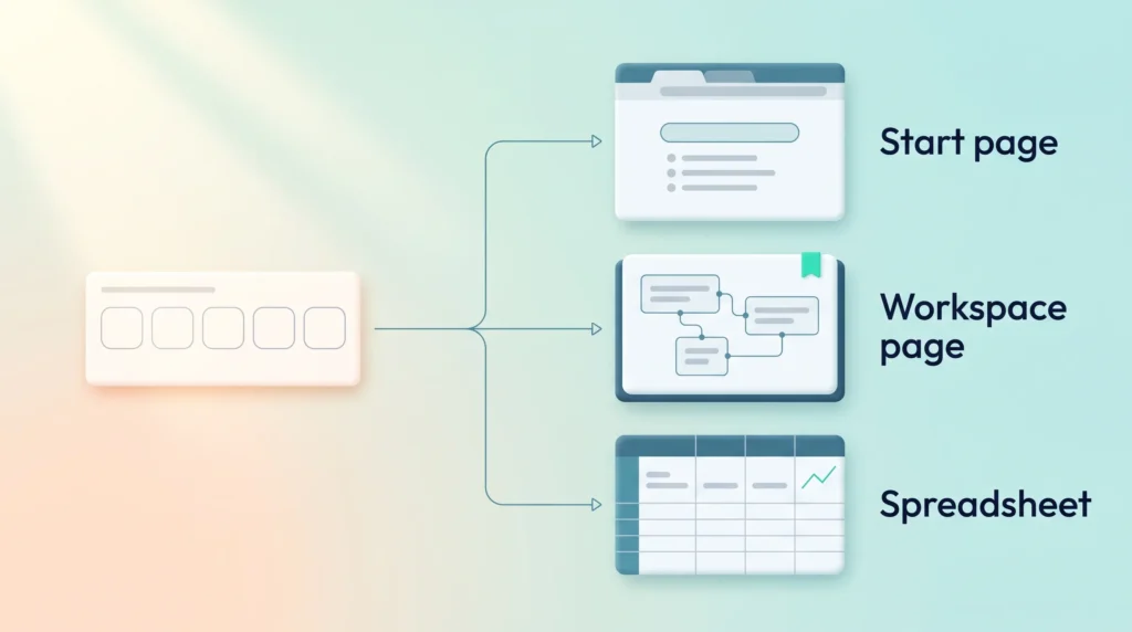
Option A: the browser start page
Replace the page your browser opens on a new tab. Extensions such as Momentum turn that page into a start screen with a daily focus prompt, a short to-do list, a timer and a clock. The strength of this option is that it costs no willpower: the dashboard appears every time you open a tab, whether you meant to check it or not.
The limitation is depth: these extensions show text and lists well, charts badly. Use this option if your dashboard is mostly “what am I doing today” and the trend can live one click away. It pairs naturally with blocking protected focus time, since the start page is where you notice a block beginning.
Option B: a page in your notes or workspace app
If you already live in Notion, Obsidian, Coda or similar, build the dashboard as a single page there. Linked database views show real task and project data rather than a copy, so the page updates itself when you tick something off elsewhere.
This is the most flexible option and the easiest to over build. Set a hard rule before you start: one screen, no scrolling. If a section does not fit, it belongs on a sub page.
If your tasks already live in a project management tool such as ClickUp, Asana or monday.com, look at its built in dashboard view before you build anything. It may already show your open tasks, due dates and progress on one page, and it stays in sync without extra work. You then only need to add the tiles it cannot show, such as your habit or your open question. Our roundup of the best productivity apps is a reasonable starting point if you have not settled on a workspace yet.
Option C: a spreadsheet
The least fashionable option and often the best one. A spreadsheet handles the parts the other two struggle with: arithmetic, weekly rollups and a sparkline next to each number. Put one row per metric, one column per week, and a small chart on the right.
It will not update itself unless you connect it to something, and for many people that is an advantage: typing last week’s numbers in by hand takes a few minutes and forces you to read them.
Whichever option you pick, tools that capture a live view from another app, such as Plus Snapshots, can bridge the gap when a number sits somewhere your dashboard cannot reach. Treat that as a patch, not a foundation.
Make the dashboard drive action, not just display it
A dashboard you read and then ignore is a nicer looking version of doing nothing. Three habits close that gap.
Start a timer from the dashboard. Reading the top task and immediately starting a fixed block turns information into a commitment. Use whichever structure suits the work: the Pomodoro technique for grinding through a backlog, a longer time block for work that needs a run up, or a stopwatch when you are exploring.
Close the loop at the end of the day. One sentence about what actually moved. It takes thirty seconds, and it is what makes the weekly view interpretable instead of a wall of numbers. It feeds straight into a weekly review.
Turn off what competes with it. A dashboard cannot win against a notification badge. Silencing chat and email for the first block is what makes the top task survive contact with the morning. See our guide to managing work notifications, and on sequencing the first hour, building a morning routine.
Sharing a dashboard with a team
A team dashboard is a different object, even if it looks similar. Its job is to remove status questions from meetings, so it should answer what people would otherwise ask: what is happening this week, what is blocked, and which number we are moving.
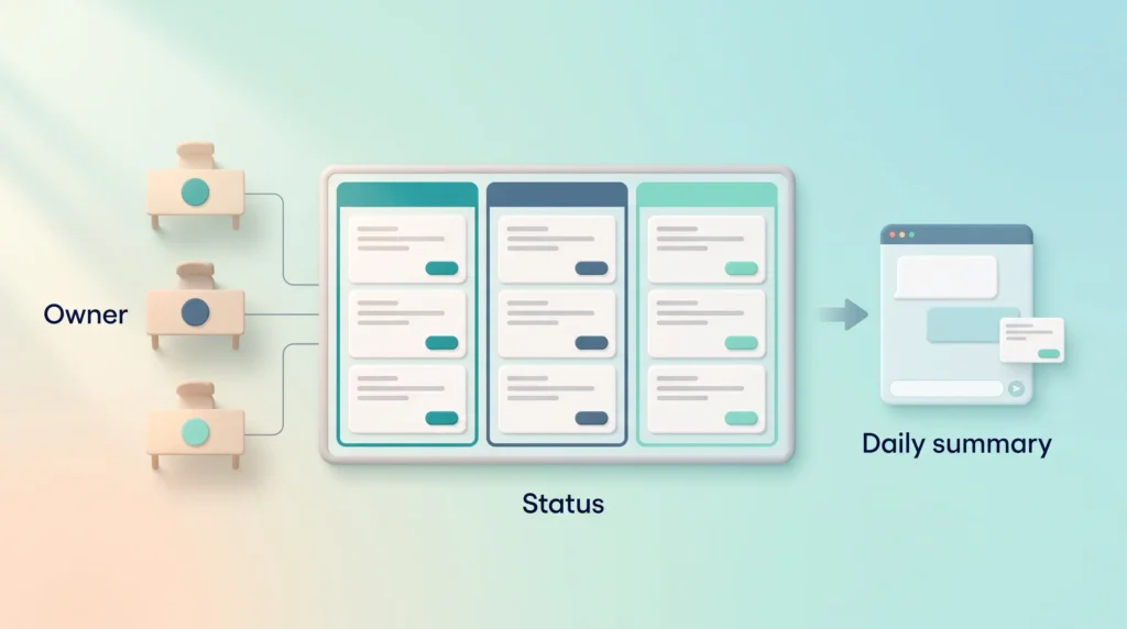
Three rules keep a shared view usable. Give each section a named owner, because an unowned tile goes stale within a fortnight and teaches people to distrust the whole page. Standardise status labels across projects so a word means the same thing everywhere. And push the summary to where the team already is, usually a channel post each morning.
Used this way, a shared dashboard shortens standups instead of adding a meeting to review it. Our guide to team productivity covers the surrounding practices, and weekly planning explains how to set the priorities it reflects.
Four mistakes that kill a dashboard
- Too many tiles. Past roughly seven, the eye stops scanning and starts skipping. Cut to five and add back only what you miss.
- Vanity metrics. Numbers that only go up (total followers, cumulative hours) tell you nothing about this week. Prefer rates and deltas.
- No refresh rhythm. If nobody knows whether a tile is from today or from March, it is noise. Put a last updated date on anything manual.
- Building for a version of yourself who does not exist. A dashboard designed around habits you hope to have gets abandoned in a week. Build for how you actually work. It helps to know your own productivity style before committing to a layout.
Keep it alive
Once a month, review the dashboard itself rather than the data on it. Which tile did I never look at? Which decision did I make without it? What has changed about my goals that the screen has not caught up with? Then delete, add or rewrite. A monthly review is the natural place for it. Almost everyone skips this, and it decides whether the dashboard is still useful in a year.
Conclusion
Start smaller than feels satisfying: one outcome, one daily metric, one top task, on whatever surface you already open first. Use it for two weeks before adding anything, and note the moments when you wanted a number that was not there. Those gaps tell you what version two should contain, far more reliably than guessing now.
The goal is not a beautiful screen. It is a morning where you know what to do before anyone else tells you.
Found this useful?
Make SmartKeys a preferred source on Google, and our articles will surface more often in your Top Stories, AI Overviews, and AI Mode.
Add as Preferred Source